Case study · Mobile payments · Personal concept
Skana
A personal concept for paying anyone in seconds , by scanning their code or typing their @username , without reading out account numbers or risking the wrong recipient.
Contents
01 · Overview
Paying someone should feel certain, not hopeful.
Sending money usually starts with someone reading out an account number. It’s slow, and one wrong digit sends money to a stranger. Skana , “Scan. Pay. Instantly.” , replaces that step: scan the code a vendor already displays, or pay someone by an @username you recognise. It’s a personal concept I designed on my own; it hasn’t been built or tested with users.
- Problem
- Account-number transfers are slow and easy to get wrong.
- Intended users
- People paying friends and everyday vendors , market stalls, restaurants, small shops
- My responsibility
- Sole product designer , concept, flows, interface and states
- Constraints
- A solo concept with no research budget , decisions are my reasoning, and hypotheses until tested
02 · Problem and opportunity
Every payment hinges on one question: is this the right person?
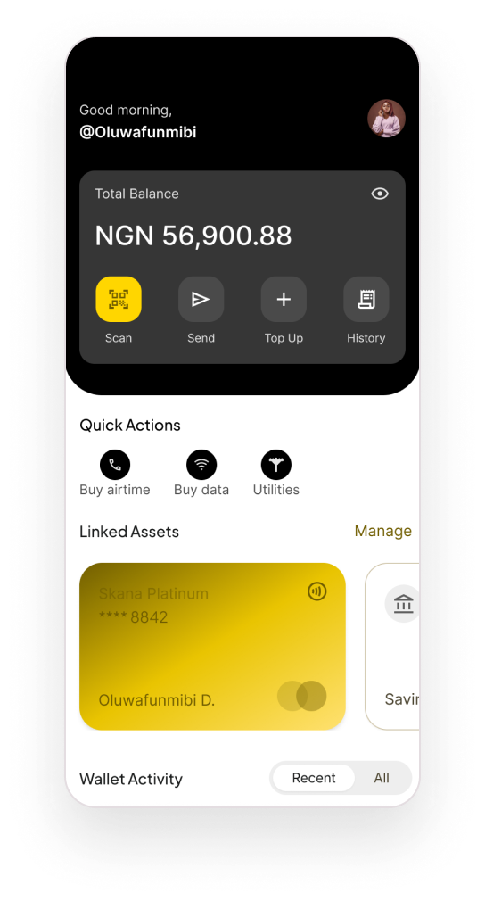
The concept stands on two entry points and one guarantee. Everything else , airtime, savings, rewards , was deliberately left out so the core journey could be complete.
What the design had to guarantee
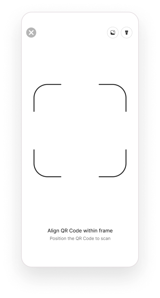
Pay by scanning a QR code
Initiate a payment straight from a code, without typing details.
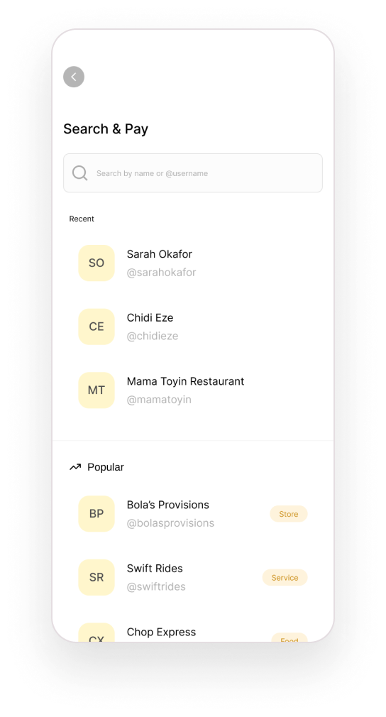
Pay by name or username
Find someone without needing their account number.
Identify and confirm the recipient
Show who will receive the money before anything moves.
Validation, loading, success and error states
Feedback at every step, including when something fails.
03 · Users and context
The riskiest moment is the one just before you pay.
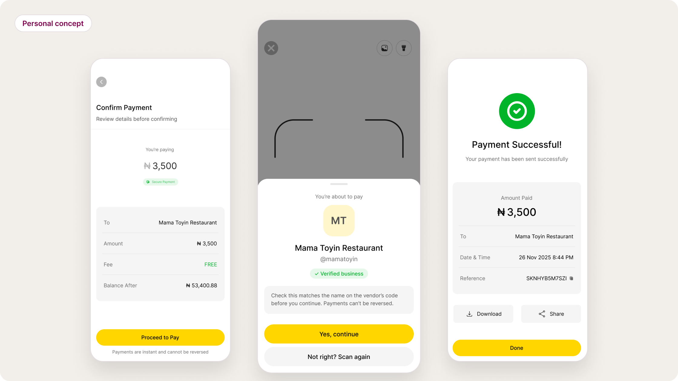
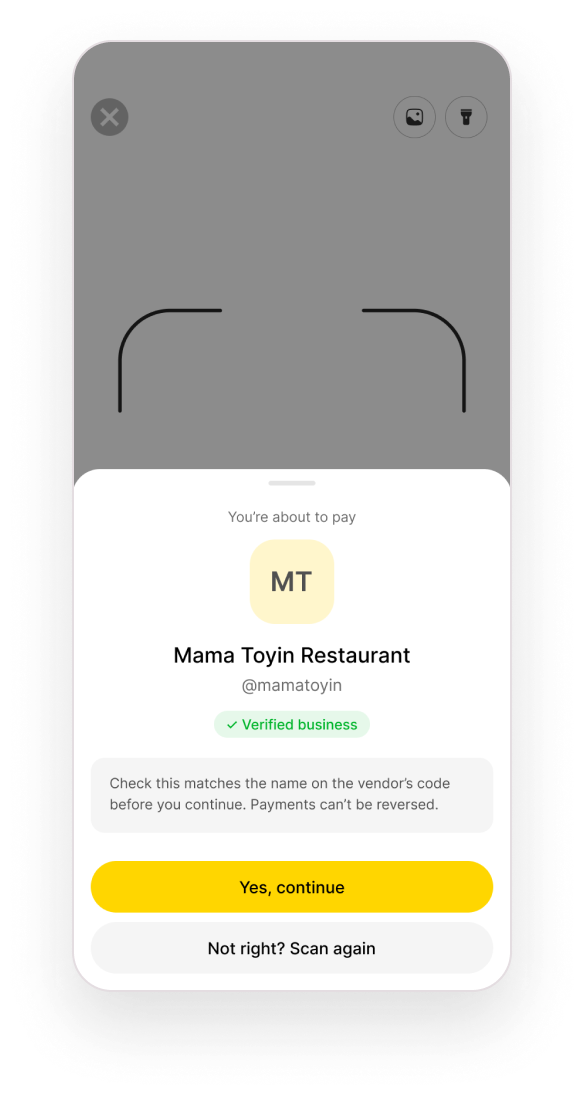
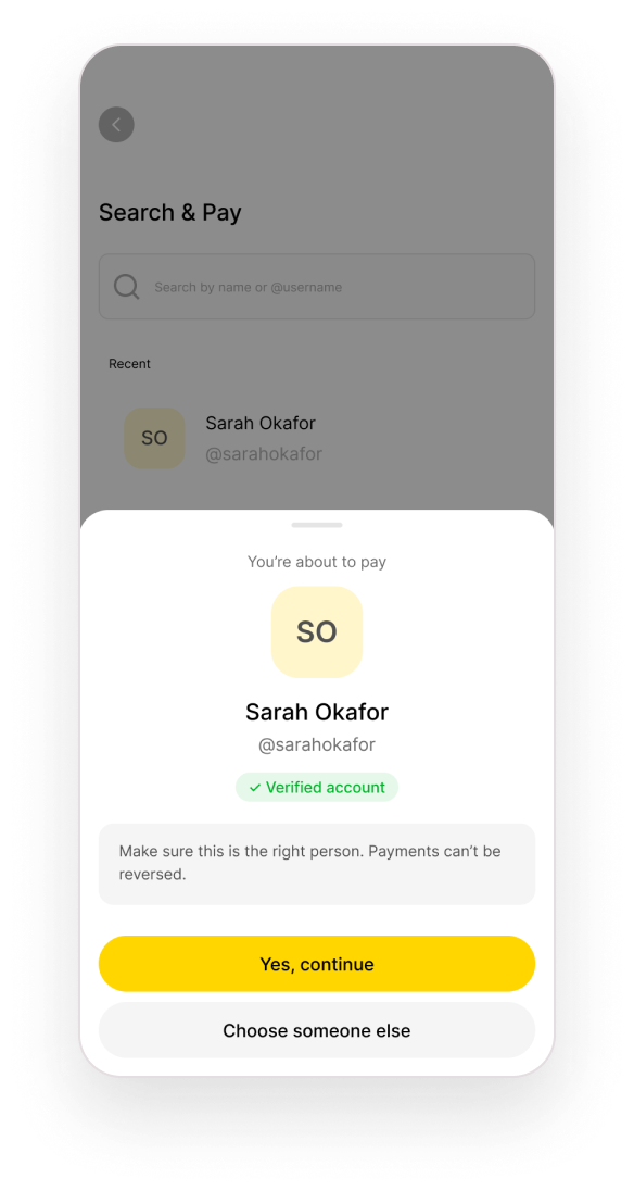
With account numbers, mistakes happen silently: you only find out after the money has gone. So Skana puts a deliberate pause at exactly one point. Whether you scanned a code or searched a username, a sheet shows the name, @username and a verification badge before anything else happens , “Yes, continue” or “Not right? Scan again”.
04 · Design strategy
One confirmation pattern for both ways to pay.
The questions that shaped it
, How does a payer confirm the recipient before money moves?
, What happens when a code or username can’t be resolved?
, How do we stop someone paying twice when a result is unclear?
Find the recipient
Pay and see the result
05 · Final solution
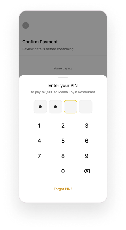
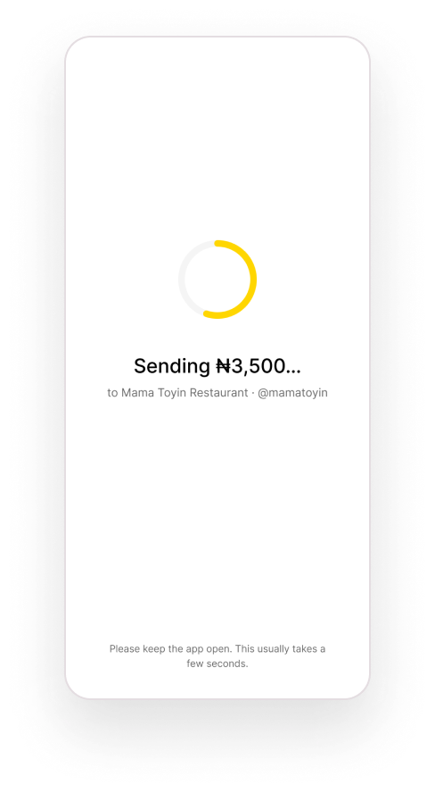
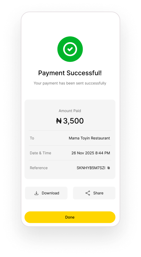
Every step answers: who, how much, and did it work?
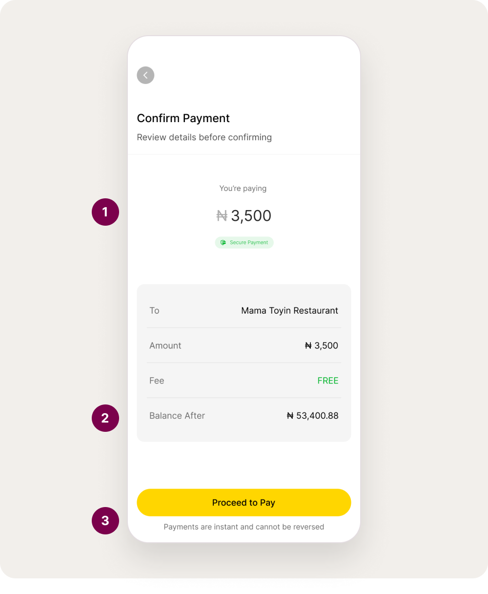
- The amount is the largest thing on screen, with the recipient named right beneath it.
- Balance after payment is shown up front, so nobody is surprised.
- “Payments are instant and cannot be reversed” , said once, just above the button.
06 · Designing for failure
Designing for when things go wrong.
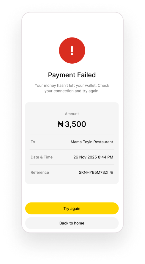
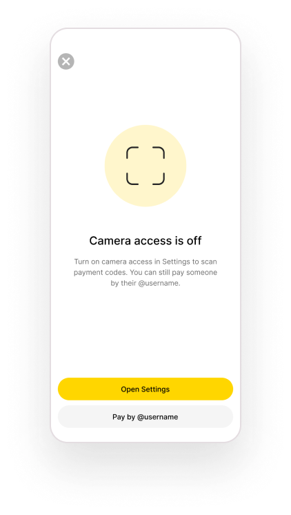
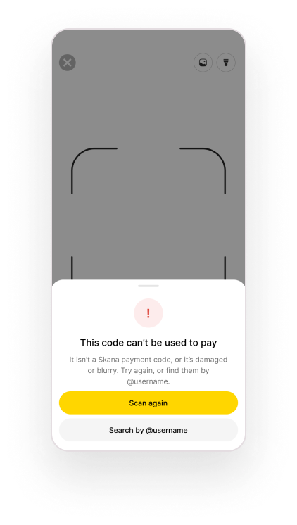
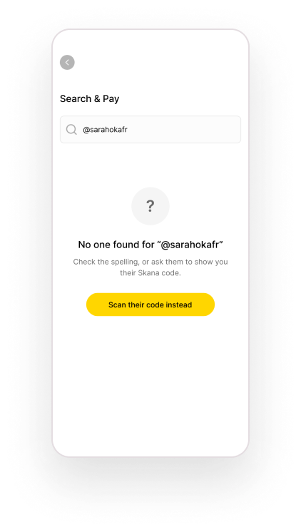
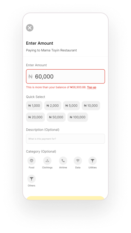
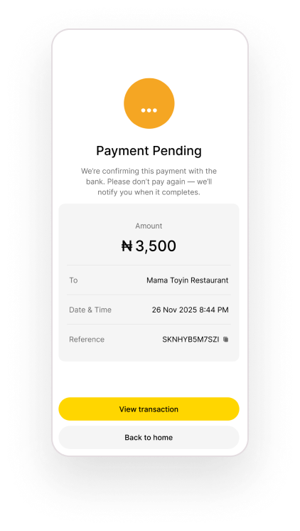
An instant payment is only trustworthy if failure is just as clear as success. Each likely problem has its own screen and a way forward: camera access off, a code that can’t be read, a username that doesn’t exist, an amount above your balance, and a payment that fails or is still pending. The pending state says plainly “please don’t pay again” , the most expensive mistake to undo.
07 · Outcomes
Where the concept stands.
- Delivered scope
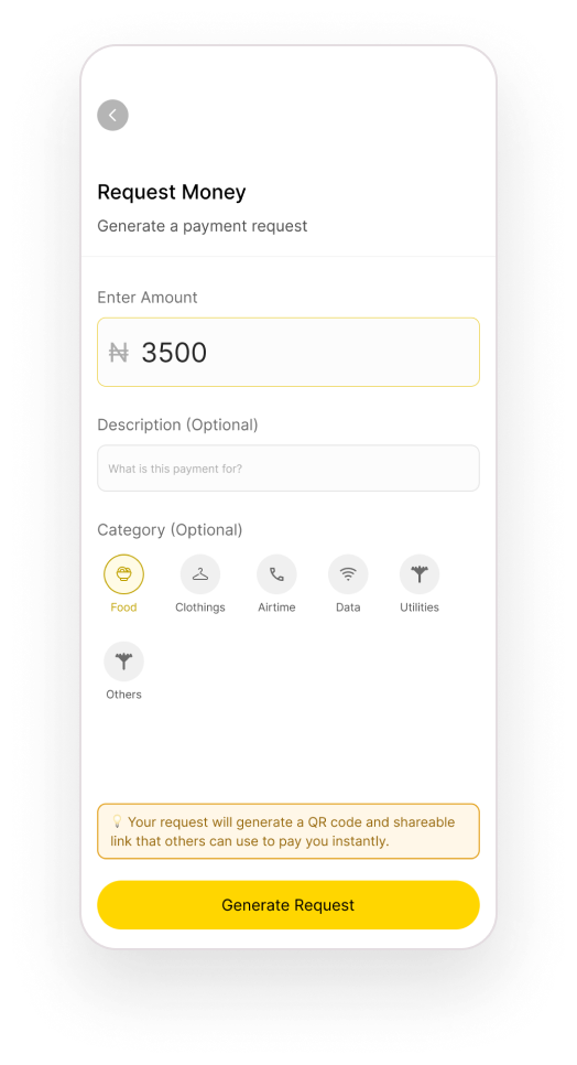
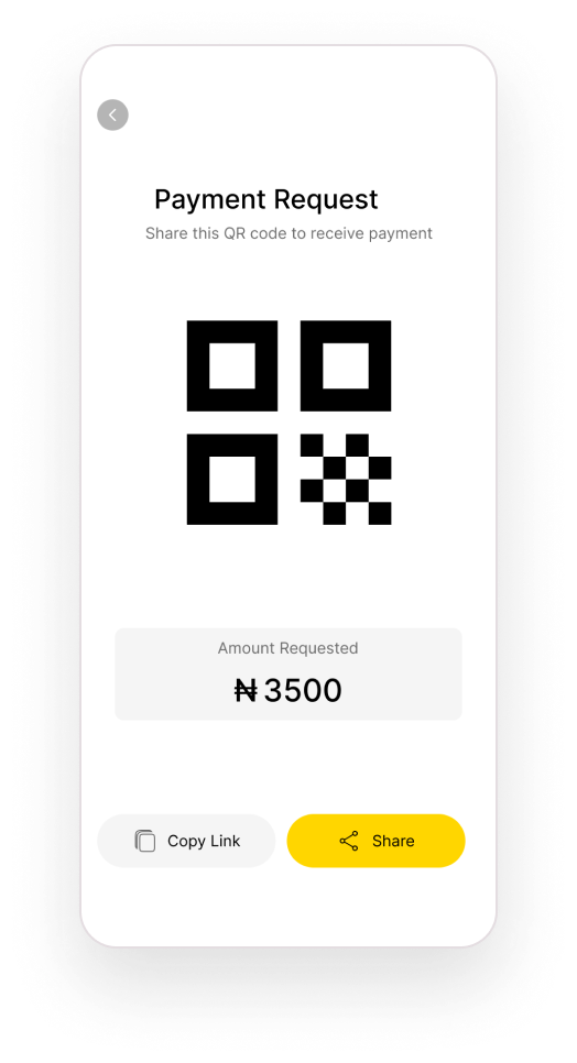
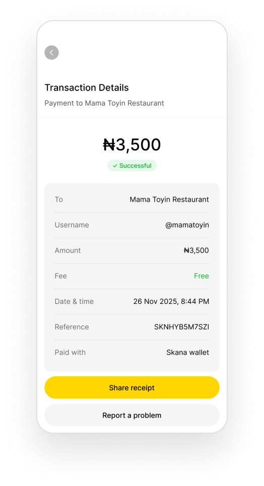
- A complete core flow: onboarding, two payment paths, recipient confirmation, PIN authorisation, success, failed and pending outcomes, receipts and request money.
- Status
- Personal concept , not built or launched.
- Validation
- Not yet tested with users. First test: can people spot a wrong recipient on the confirmation sheet?
08 · Reflection
Speed only matters if people trust it.
What worked
Putting one confirmation step where both paths meet kept the flow fast without hiding the moment that matters most.
What was hard
Keeping the scope small. Earlier explorations drifted into rewards, savings and merchant discovery; cutting them made the core journey complete.
What I’d change
Test the confirmation sheet early with real vendors and their customers, especially in low light and on busy market stalls.
What I learned
Error states aren’t an afterthought in payments , they are the product. Users judge the whole app by what happens when something goes wrong.