Case study · Property rental
OgaRent
Redesigning a live Nigerian rental platform , from V1 to V2 across the mobile app, website and admin , around the features its users asked for, without losing the fairness rules that set it apart.
Contents
01 · Overview
A fair rental platform whose users wanted more.
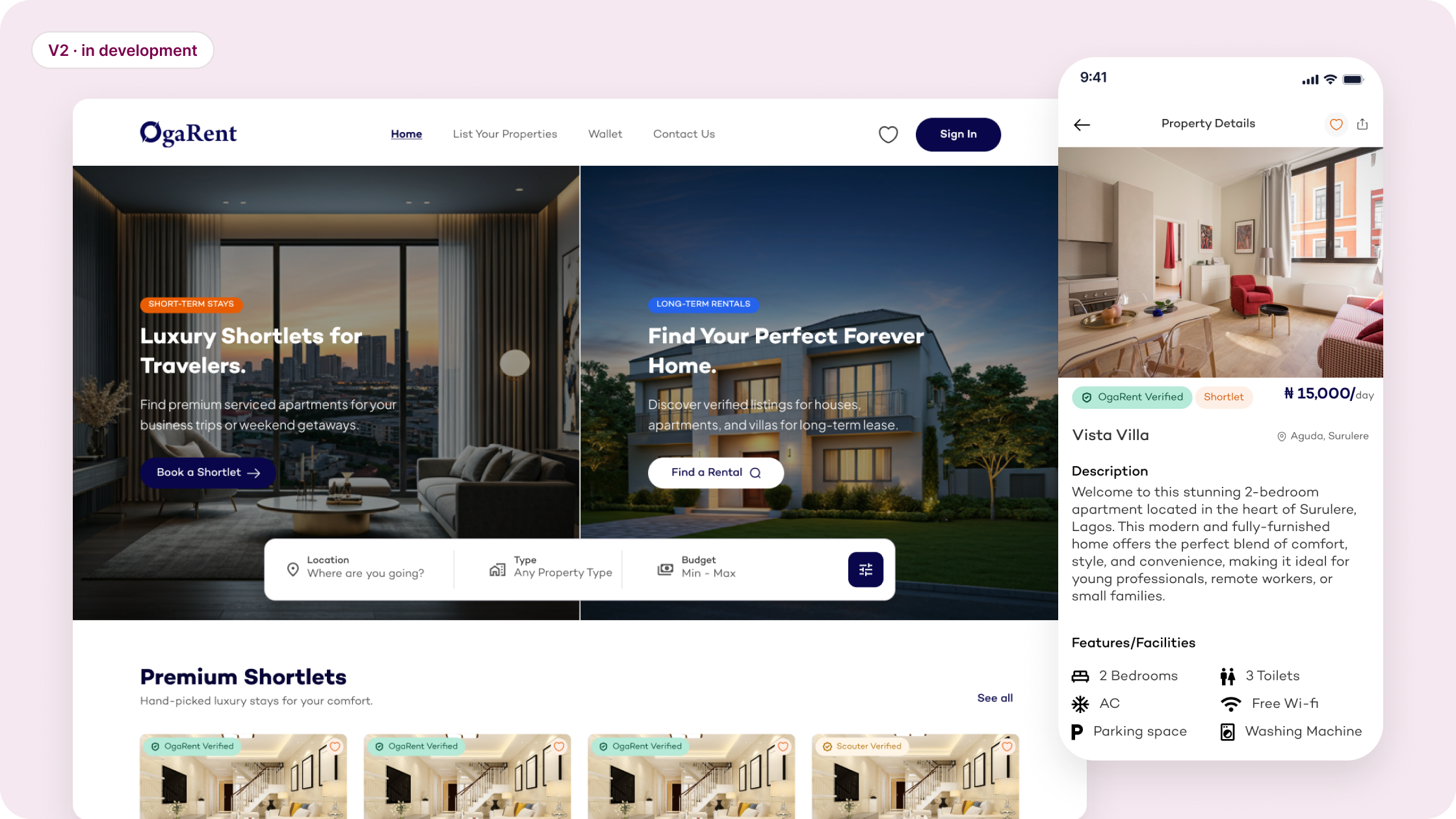
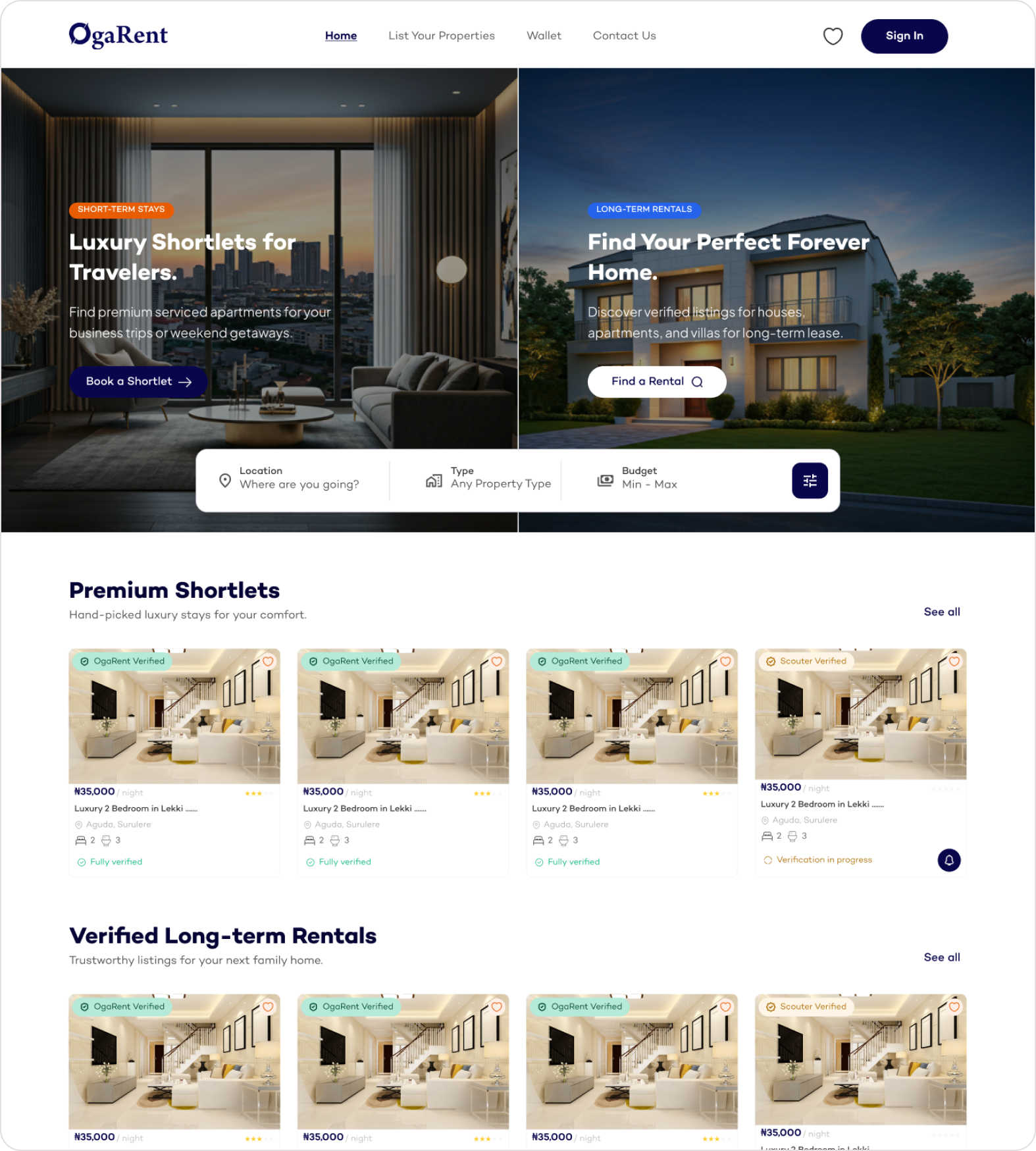
OgaRent is a Nigerian platform for verified short-term and long-term rentals, built to make renting fairer and more transparent. V1 is live and performing well. V2 is a three-week redesign across the mobile app, website and admin dashboard, shaped largely by features V1 users requested. I designed all of it , the UI kit, every screen and the admin , working with the project manager, developers and founders, and handed over with full documentation.
- Problem
- Add the capabilities V1 users were asking for, across three surfaces, without blurring the rules that make OgaRent fair.
- Intended users
- Home seekers, property owners and , new in V2 , scouters who verify listings
- My responsibility
- Product Designer , end to end, from UI kit to admin
- Constraints
- Three weeks for V2; a live V1 and its existing rules to build on; payments handled externally by Paystack
02 · Problem and opportunity
V1 worked. Users wanted more.
Most of V2’s scope came directly from what V1 users asked for. The challenge was adding that scope , new roles, verification, inspections, offers, stay management , while keeping OgaRent’s fairness rules just as clear.
The fairness rules V2 builds on
Agent fees capped at 10% on rentals
Renters know the most they’ll pay. Sales carry a separate fee.
Rented listings block automatically
Live in V1. Owners can also switch availability off if a property is booked elsewhere.
A locked, refundable caution fee
Shown up front as a one-time fee and returned after the stay.
Secure checkout through Paystack
Payment happens on Paystack’s external checkout.
03 · Users and context
Trust can’t rest on the owner’s word alone.
V2 adds a third role. Alongside home seekers and property owners, scouters visit and verify properties in exchange for commission. Onboarding now starts by asking people which of the three they are, so each gets only the steps that apply to them.
04 · Design strategy
Make every rule visible at the moment it matters.
The questions that shaped it
, Where does a renter first see what they’ll pay, including the caution fee?
, How does someone tell a fully verified listing from one still being checked?
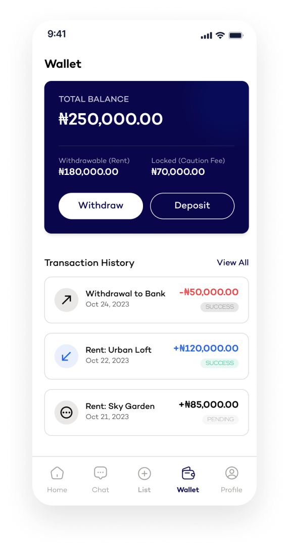
, How does an owner see which money they can withdraw and which is held as a caution fee?
05 · Final solution
Verification and fees, made visible.
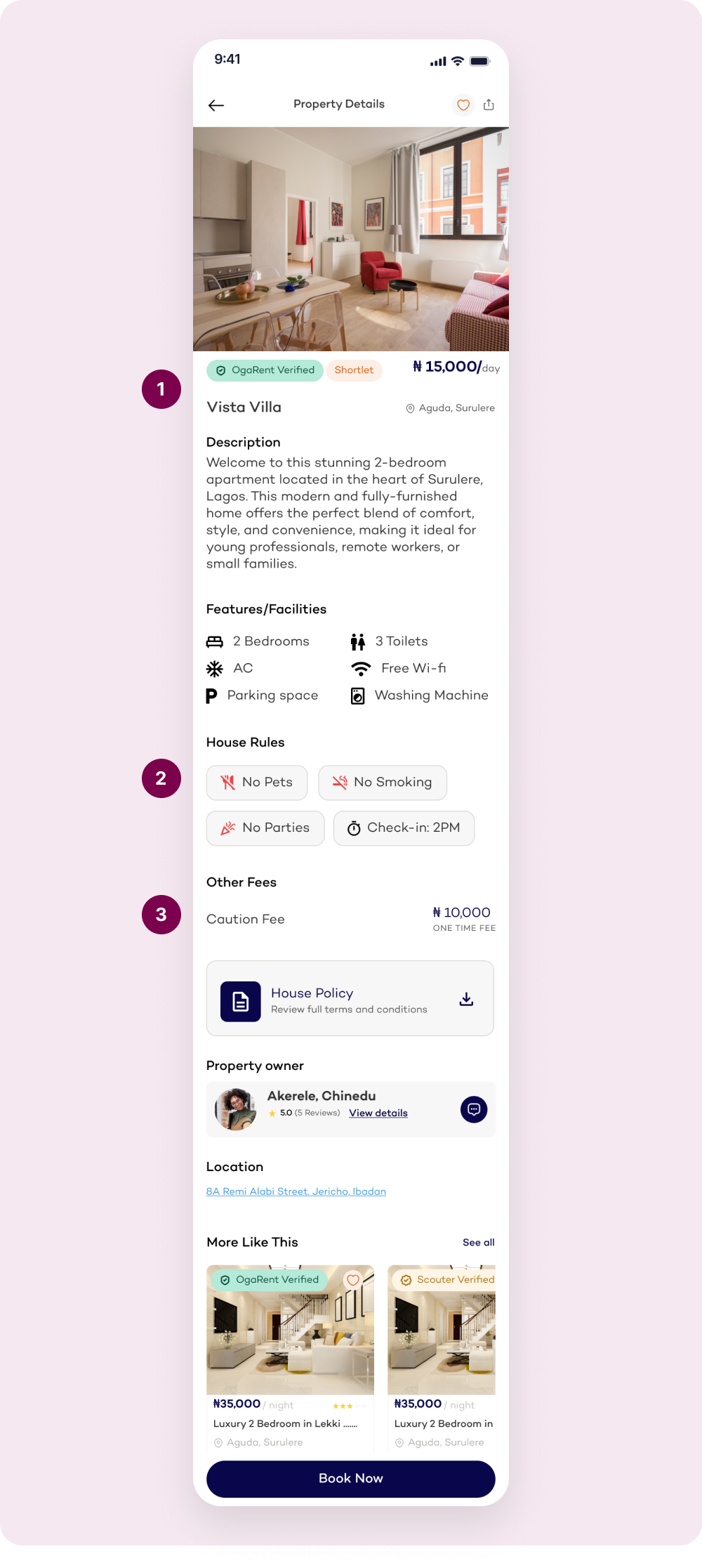
- Verification comes first: an “OgaRent Verified” badge sits above the price, next to the listing type.
- House rules as scannable chips, with the full house policy one tap away.
- The caution fee is shown up front as a one-time fee, before anyone books.
06 · System and implementation
One system across three surfaces.
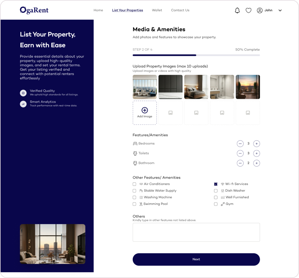
I built the UI kit , typography, colour, badges, forms, notifications, icons and shared components like the property card , and used it across mobile, web and admin. Verification levels became component variants, so the same badge logic appears on every card and screen. Developers received full handoff documentation.
07 · Outcomes
What was delivered.
- Delivered scope
- V2 designs for the mobile app, website and admin dashboard, plus the UI kit and handoff documentation, in three weeks.
- Status
- V1 is live. V2 is being built , the screens shown here are designs, not shipped features.
- Validation
- Tested internally with the team. The product owners signed off, and V2 moved into development.
08 · Reflection
Rules people can see are rules people trust.
What worked
Starting from what V1 users actually asked for kept V2 focused, and building the UI kit first let one set of components carry the mobile app, website and admin.
What was hard
Fitting three surfaces and a new role into three weeks , while making sure new features like offers and inspections never blurred the fee cap or listing rules.
What I’d change
Plan a lightweight way to measure V2 against V1 from day one, so the impact of each new feature is clear once it ships.
What I learned
Fairness only works if people can see it. Showing fees, verification and availability at the exact moment they matter does more than any policy page.