A live video platform for sharing short videos and for watching films pay-per-view: viewers pay only for what they watch, and creators set their own prices.
iOS, Android, web, smart TV and admin , all designed by me
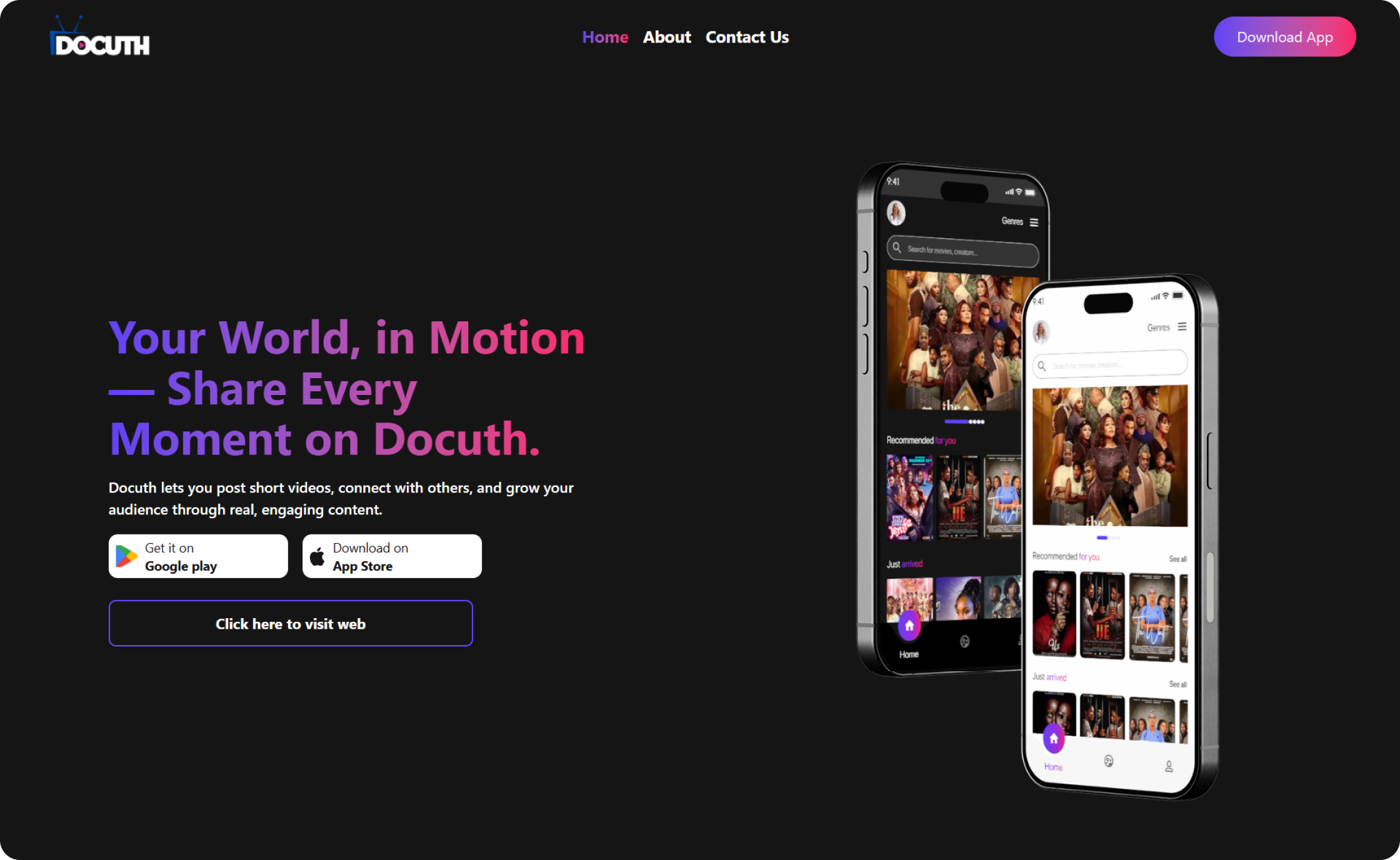
docuth.com , the public website, with the app’s home screen in dark and light themes.
Mobile
iOS · Android
Web
Website · web app
TV
Android TV · Fire TV · Samsung · LG · VIDAA
Admin
Internal dashboard
The product
Two audiences, one exchange.
Docuth combines creator sharing with a pay-per-view streaming experience. Instead of relying only on a monthly subscription, viewers pay to access the titles they choose , so each title has to earn that decision. Creators sit on the other side of the same exchange: they publish, price and build an audience for their work.
This describes the product as a whole, not what I designed. My contribution is set out below.
Viewers
Pay only for what you watch , no monthly subscription
Transparent pricing, no hidden fees
Watch now or schedule, with a 24-hour viewing window
Stream on mobile , plus web and smart TV
rents a title →Docuth← paid per rental
Creators
Upload films, documentaries and short videos
Set your own pricing
Get paid when viewers rent, with transparent analytics
Viewer insights and affiliate analytics
Explanatory diagram based on docuth.com’s “Docuth for Creators” and “Docuth for Viewers” sections , not a product screen.
The design questions
Pay-per-view changes the moment of choice. Every title asks the viewer for a small decision , so the experience has to give them enough to decide well.
01
How might viewers understand and evaluate a title before paying to watch it?
02
How might the experience support discovery across different kinds of content?
03
How might one product serve viewers and creators with different goals?
Framing questions for this case study , not research findings.
My contribution
The only designer, across every surface.
I was the sole product designer on Docuth, designing the whole product in about two months in 2026: the iOS and Android apps, the website, the smart-TV apps and the admin dashboard.
Mobile
iOS and Android apps
Web
Website and web app
TV
Android TV, Amazon Fire TV, Samsung and LG smart TVs, and Hisense VIDAA
Admin
Internal admin dashboard , not shown, as it isn’t public
Who I worked with
The project owner, a project manager, developers, graphic designers and marketers. As the only designer, I was the design voice for all of them, across every platform.
Key experience and design decisions
Decision 01
One search for films and creators
What it does
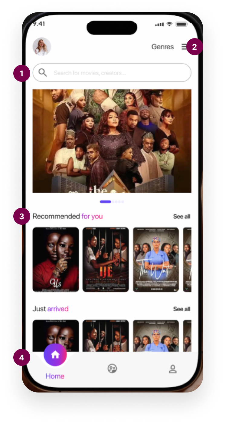
The home screen opens with a single search field , “Search for movies, creators…” , because on Docuth people are looking for both titles and the people who make them.
Why it matters
The product has two sides; search shouldn’t make viewers choose which one they mean.
One search field for “movies, creators…” , both sides of the product, one place to look.
Genres sit in the header, one tap from anywhere on home.
“Recommended for you” and “Just arrived” rails give personal and fresh starting points.
A raised Home button anchors a three-item bottom bar: Home, Explore, Profile.
Docuth app home, light theme , as shown on docuth.com.
Decision 02
Discovery that feels curated and current
What it does
A featured carousel leads into “Recommended for you” and “Just arrived” rails, with genres one tap away in the header.
Why it matters
When every title costs money, people need confidence it suits them , and a reason to come back for what’s new.
Decision 03
Decide before you pay, then watch on your schedule
What it does
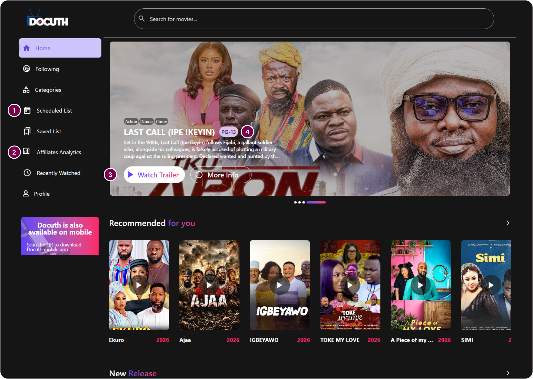
Before paying, a title shows its trailer, synopsis, genres and age rating. After renting, viewers can watch now or schedule a start time and get a 24-hour window , with a Scheduled List in the web app to keep those plans in one place.
Why it matters
Every title is a small purchase, so people need enough to decide well , and pay-per-view shouldn’t feel like a race once they have.
Scheduled List , rented titles you’ve planned to watch, kept in one place.
Affiliates Analytics sits in the same sidebar as viewing , one product for both sides.
“Watch Trailer” and “More Info” come before any purchase.
Genres and age rating (PG-13) up front, so a title is easy to judge at a glance.
web.docuth.com , the web app home: sidebar navigation, a featured title with trailer, and genre rails.
Designing for viewers and creators
For viewers
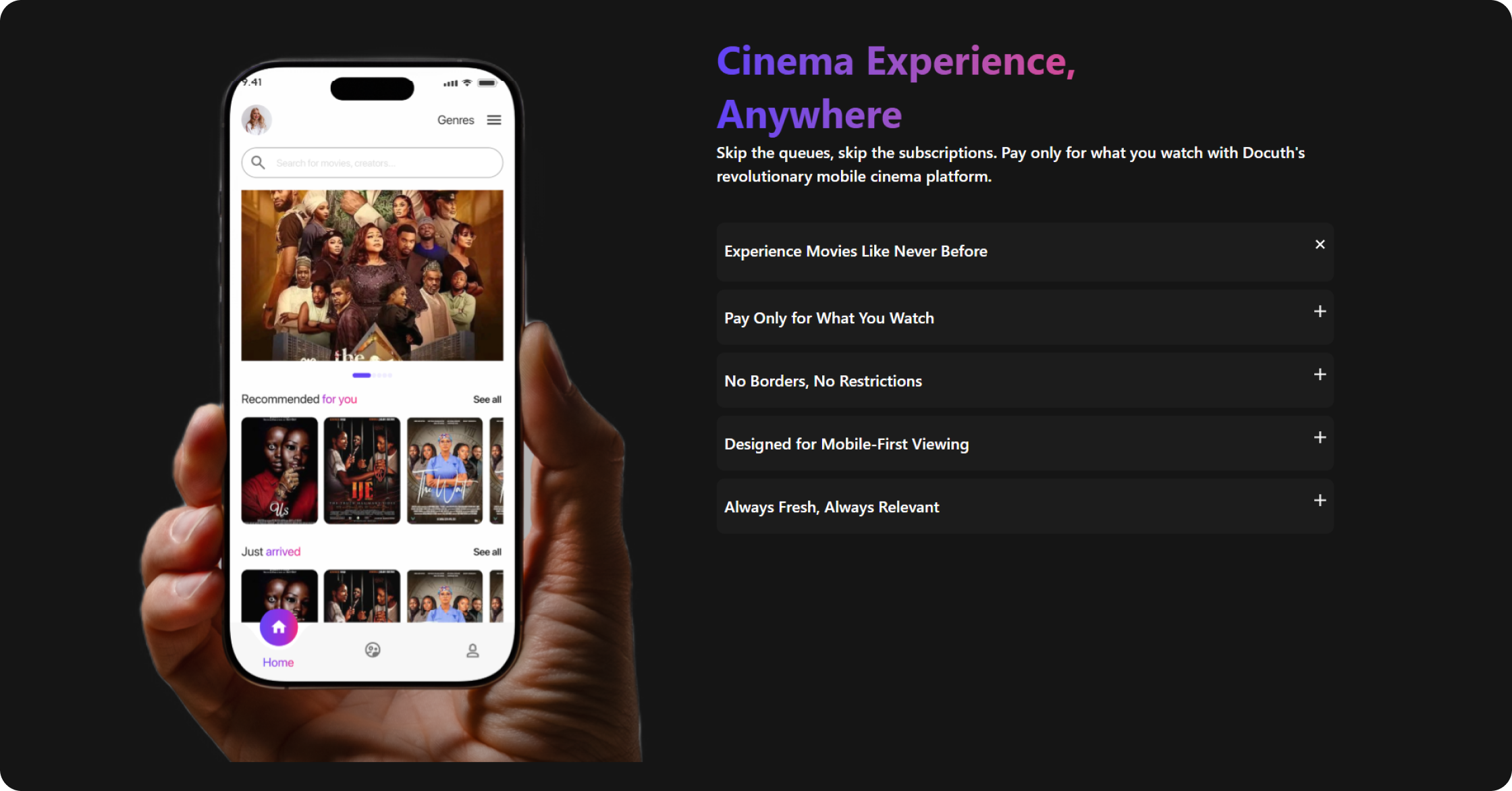
A “cinema experience in your pocket”: pay only for the films you actually watch, with transparent pricing and no surprise charges , and an interface designed for mobile viewing.
For creators
A direct route to an audience: upload films and documentaries, set your own price, get paid when viewers rent, and see insights about who’s watching.
Constraints and trade-offs
01
Two months
The whole product , every platform , was designed in roughly two months.
02
One designer
No design team to split the work: consistency across platforms depended on one set of decisions.
03
Many screens, many inputs
Touchscreens, browsers and TV remotes on Android TV, Fire TV, Samsung, LG and VIDAA , each with different ways to navigate.
Outcome
Live product
Docuth is live on iOS, Android, the web and smart TVs.