Concept / self-initiated

Design system · Furniture e-commerce

Designing a scalable design system for furniture e-commerce

Forma & Field is a furniture retailer I created to explore one question: how far can a single, well-structured system carry a shopping experience , from the first browse to the final confirmation? It covers tokens, reusable components, commerce patterns and six full page templates.

Role
Product Designer / Design Systems Designer
Type
Independent concept project
Year
2026
Focus
Design systems, UI architecture, reusable components, e-commerce patterns, documentation
Tool
Figma
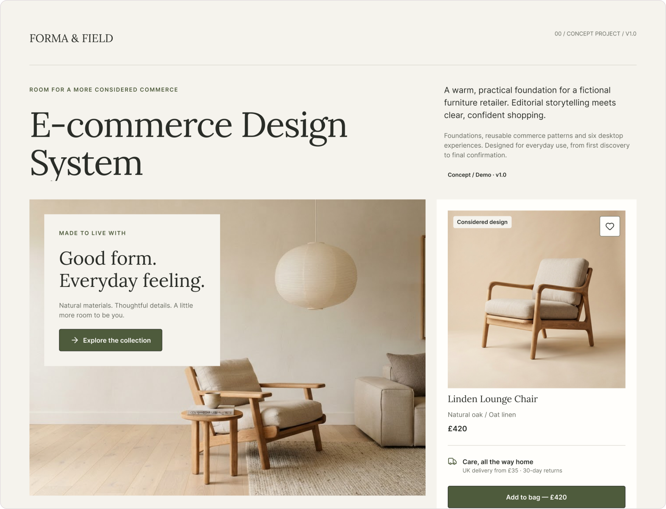
Forma & Field design system cover: room scene, Linden Lounge Chair product card and palette
The system’s cover: an editorial room scene, a product card built from the system’s components, and the core palette , Charcoal, Field olive, Taupe, Sand and Natural white.

Project overview

A system, not a shop.

Furniture shopping mixes two moods: editorial inspiration and practical decisions about size, finish, price and delivery. I wanted a system that could hold both , warm enough to sell a room, clear enough to buy a chair.

So rather than designing screens one by one, I built the layers underneath them first, then used those layers to assemble a full shopping journey.

94variables across 3 tiers
33text styles
17component sets · 61 variants
6full desktop templates
10usage guidelines

Counts read directly from the Figma file. Forma & Field is a fictional brand; the system is a concept and isn’t used by a real retailer.

The design challenge

Many small decisions, made the same way every time.

A furniture store repeats the same ideas everywhere: a product, its price, its options, whether it’s available, what happens next. Designed separately, each screen answers those questions slightly differently.

Product cards

Image, name, attributes and price in the same order , whether a piece is full price, on sale or out of stock.

Search and filters

Sort kept separate from filters; applied filters visible as removable chips; result counts that stay honest.

Price and product information

Current price, previous price and an explicit saving , never red alone to signal a sale.

Forms and checkout

The same label, input and helper structure from the promo code to the delivery address.

Feedback and states

Selected, unavailable, loading and error states that explain themselves in words, not just colour.

Shared foundations

One spacing rhythm, one type pairing and one restrained palette behind all of it.

System architecture

Every value has one responsibility.

I organised the file the way the system is meant to be used: foundations first, then tokens, type and icons, then component families, then the templates and guidelines that put them to work.

FoundationsColour roles · type · space
VariablesPrimitive → Semantic → Component
Type & icons33 text styles · Lora × Inter
Components5 families · 17 sets
Templates6 desktop pages
Guidelines10 usage rules

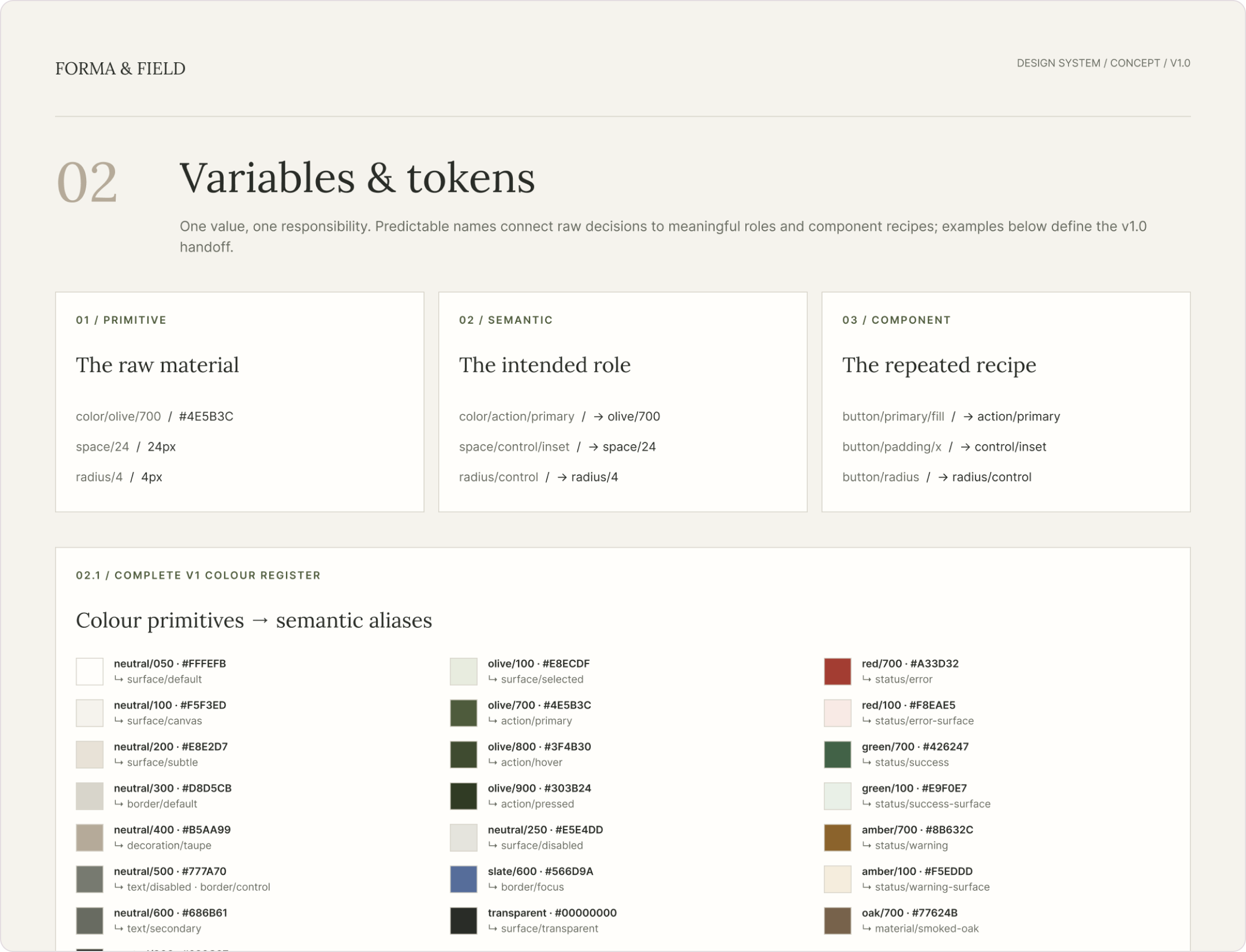
Primitive

color/olive/700

#4E5B3C

Semantic

color/action/primary

→ olive/700

Component

button/primary/fill

→ action/primary

Variables & Tokens page: three tiers and the colour register
The real variable collections: 43 primitives, 38 semantic roles and 13 component recipes. Changing olive/700 updates every action that uses it.

Foundations

Quiet surfaces, so the furniture can speak.

The palette is deliberately restrained , ivory, charcoal, taupe , so product photography carries the colour. Field olive is reserved for actions and selected states, never for decoration.

Lora gives headlines warmth; Inter keeps prices, labels and forms clear. A 4px spacing base keeps rhythm consistent from a chip to a full page.

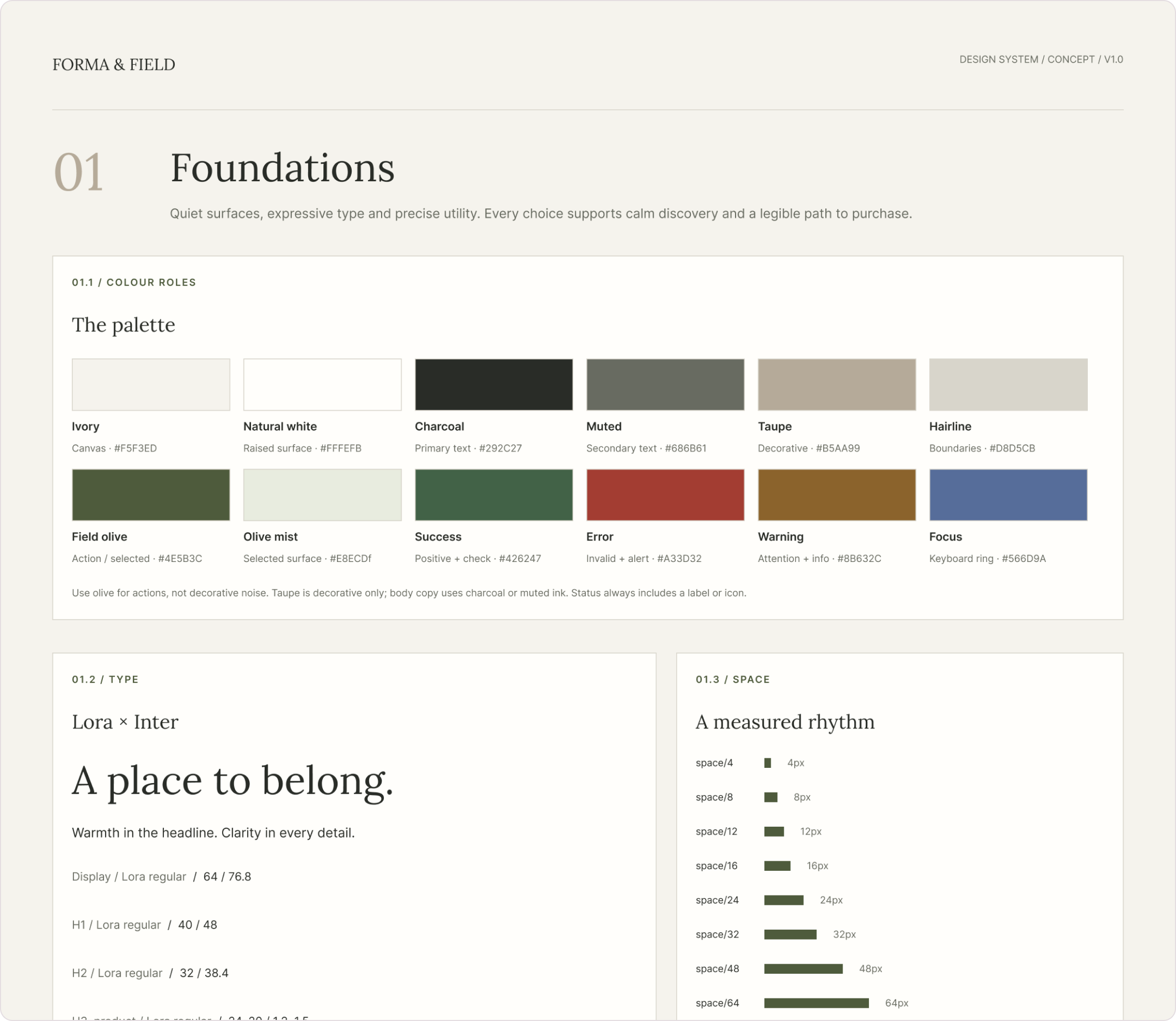
Foundations page: colour roles and the Lora × Inter type scale

Colour with a job

Each colour is named for its role: Canvas, Raised surface, Primary text, Action / selected, Focus. Status colours always pair with a label or icon.

Two typefaces, two jobs

“Lora for the story. Inter for the shop.” Display 64 down to labels at 12, with semibold Inter for prices.

A measured rhythm

8–16px inside a control group, 24px between items, 48–80px between sections , written into the guidelines, not just the spacing scale.

Visible focus

A dedicated Focus colour (#566D9A) and a persistent 3px focus ring, separate from hover and selection.

Component architecture

Five families, built as native components.

Each component page pairs a documentation board , the component in context, with its rules , and a native library of variants. Here are the families that do the most work.

Navigation & actions

Button (13 variants) · Icon button · Chip · Badge · Tab · Navigation

One primary action per task. Buttons vary by intent , Primary, Secondary, Tertiary, Destructive , and every state is named: default, pressed, disabled, loading, focus. The header keeps 44px targets on every utility action.
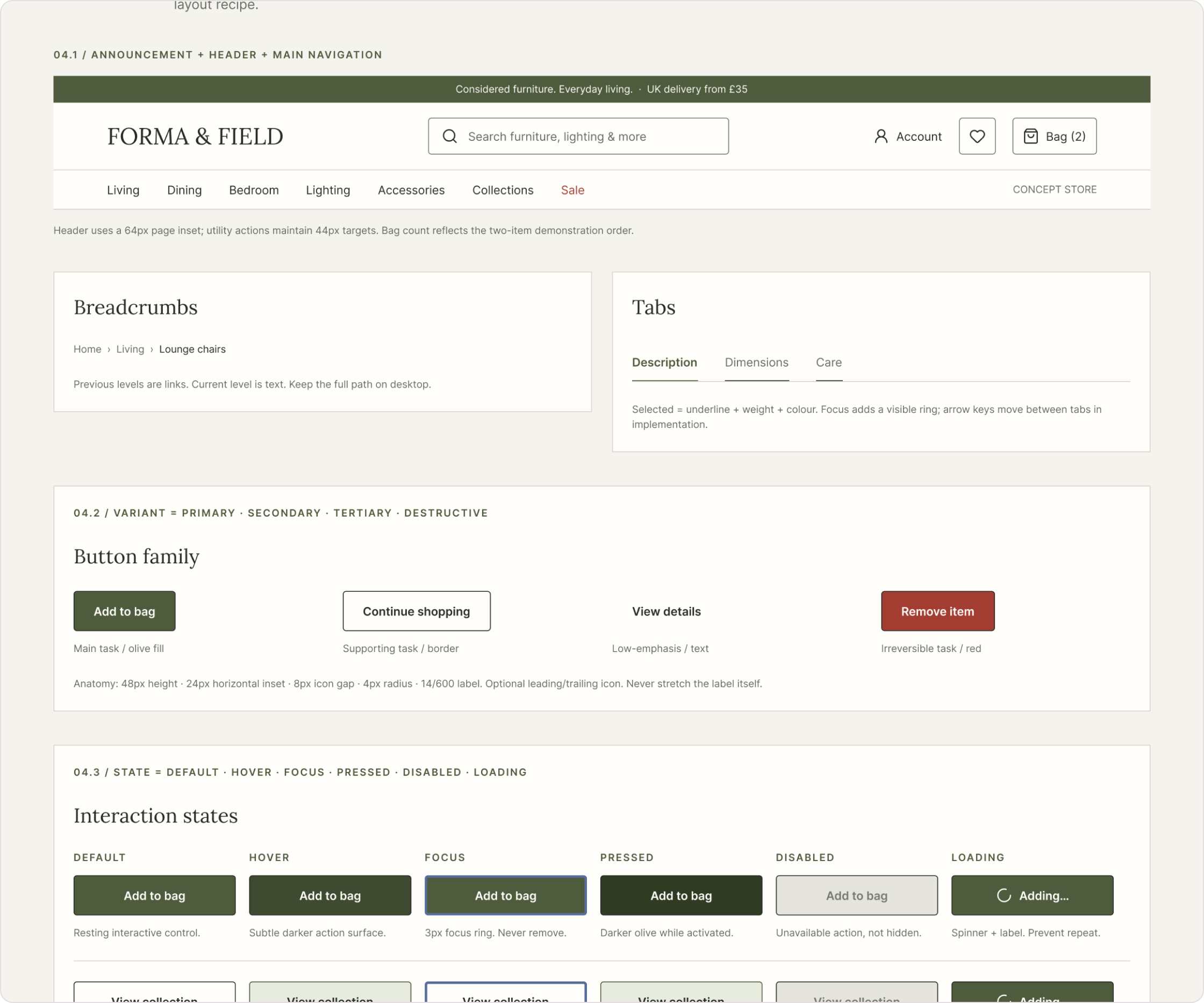
Navigation & actions documentation board

Product discovery

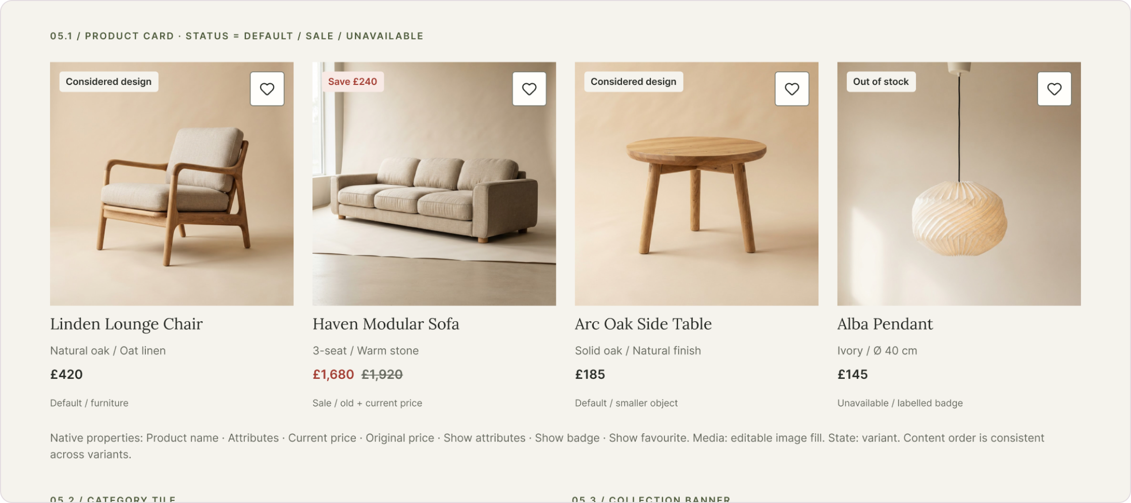
Product Card (5 variants) · Filter option · Category tile

The product card keeps the same anatomy , media, name, attributes, price , whether a piece is default, on sale or unavailable. Status changes the badge and price, never the structure.

Product discovery documentation board

Product details

Product gallery · Gallery thumbnail · Swatch

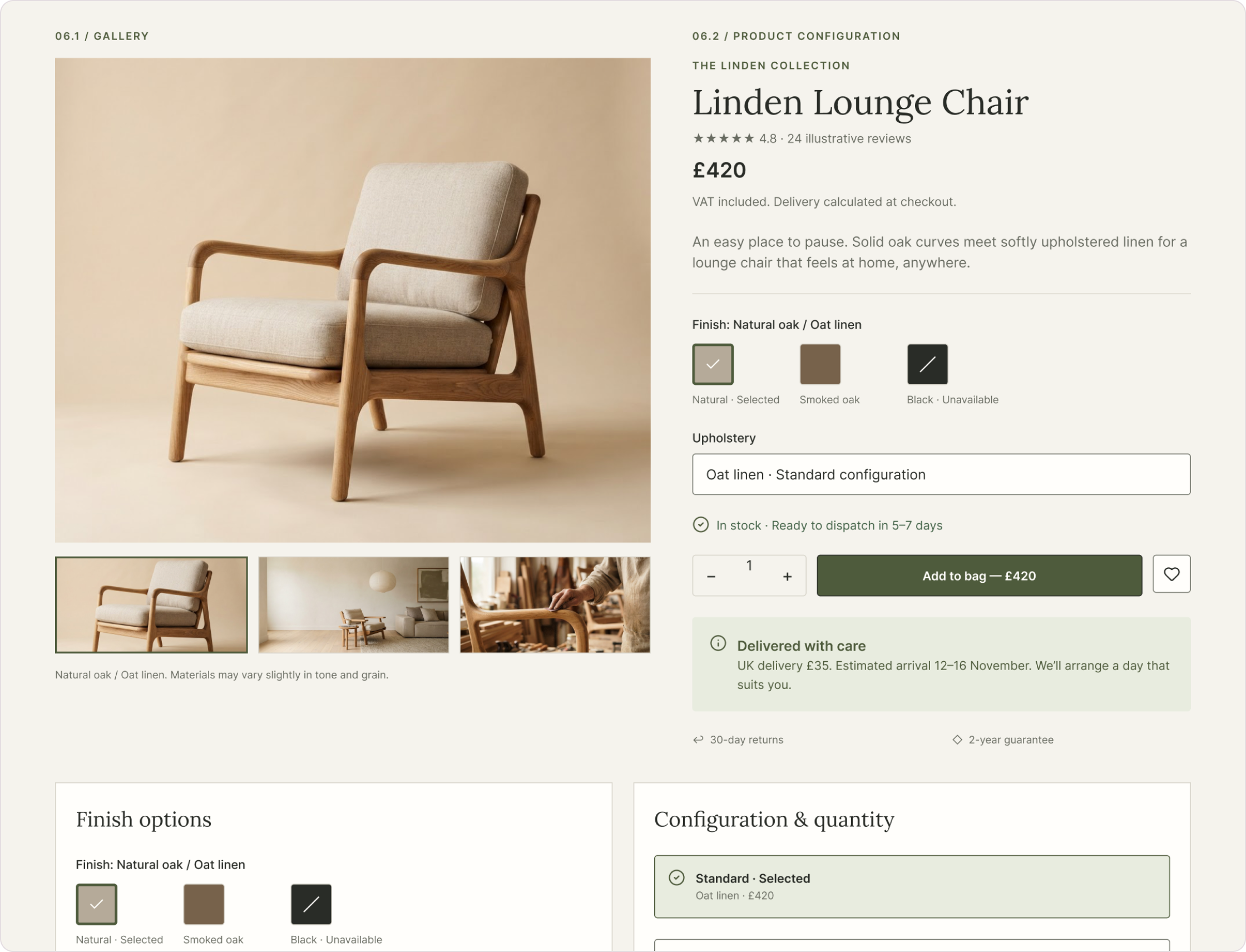
Availability, price and the purchase action stay together. Swatches show “Selected” with a border, check and text, and “Unavailable” with a slash and an explicit label , never colour alone.

Product details documentation board

Cart, checkout & forms

Form Field (7 variants) · Selection option · Cart Item · Order summary

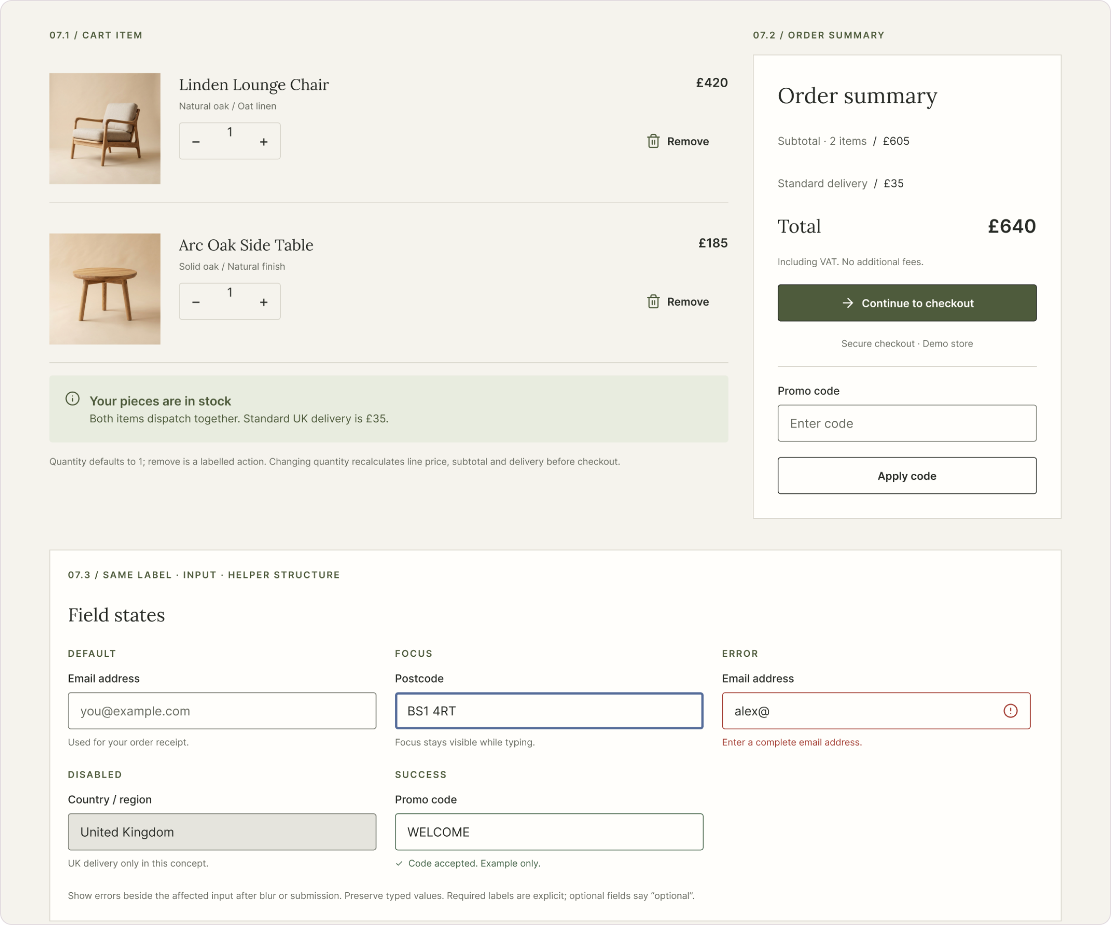
Every field shares one label → input → helper structure, so validation looks the same everywhere. Totals are transparent: subtotal, delivery and “Including VAT. No additional fees.”

Cart, checkout & forms documentation board

Commerce patterns

Six templates, one journey.

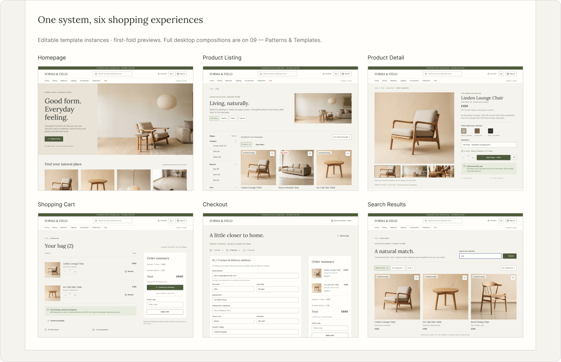
I assembled six full 1440px desktop templates from the same components to test whether the system holds together across a realistic journey. They demonstrate the intended experience , they aren’t a live prototype.

Homepage
Product Listing
Product Detail
Shopping Cart
Checkout

Search Results is a parallel entry point.

All six Forma & Field shopping templates side by side
From the System Showcase: all six templates , Homepage, Product Listing, Product Detail, Shopping Cart, Checkout and Search Results , assembled from the same components and tokens.

States

Every state explains itself.

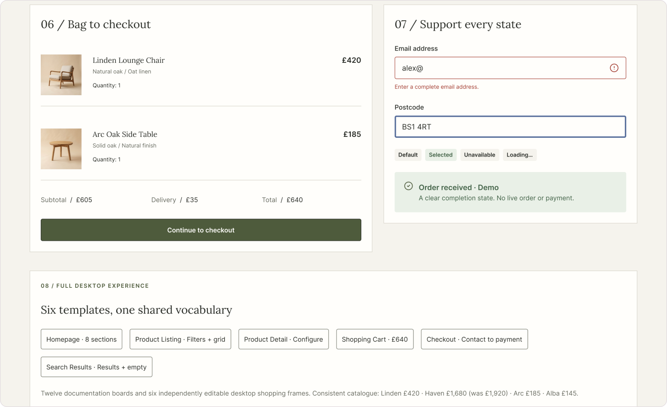
States say what’s possible, what’s happening and what to do next. Each example in the file is explicitly named , no generic variant labels, no colour-only feedback.

System Showcase panels: bag to checkout and support every state
From the System Showcase: line items carried into checkout, a field error that explains the fix, focus, selected, unavailable and loading states, and an order-received confirmation.

In the file

Default, pressed, disabled, loading (“Adding…”) and focus for the primary action; saved favourites; selected, focus and unavailable options; default → focus → error → success for fields; an empty search state.

Future work

Desktop is the only breakpoint designed so far. Responsive specifications, catalogue loading states and a full accessibility review are natural next steps.

Usage guidelines

Rules for a growing catalogue.

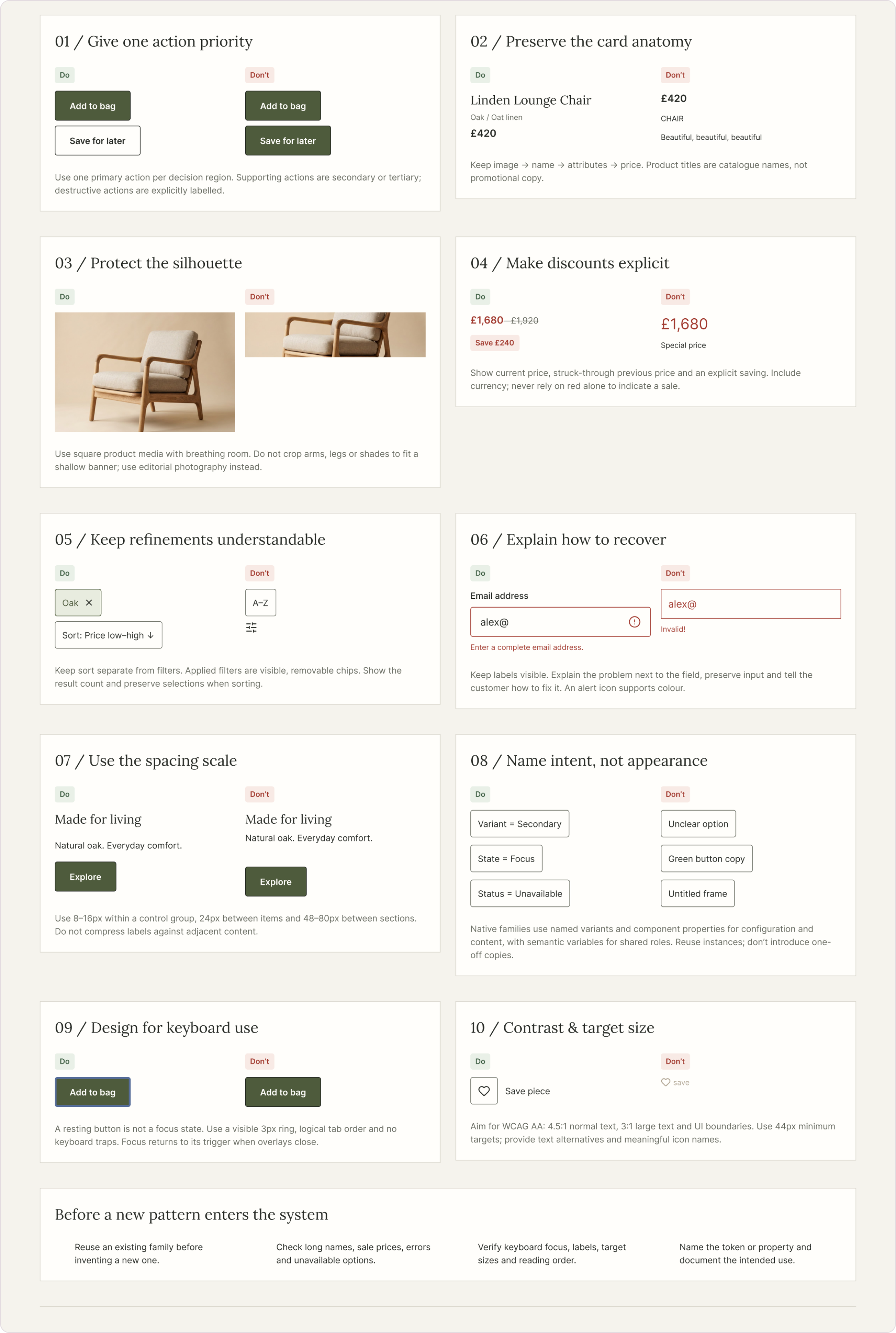
Components alone don’t keep a system consistent; shared judgement does. The file closes with ten do/don’t comparisons , instructions, not alternate variants , and a short checklist every new pattern must pass before it joins the system.

Usage Guidelines board: ten do and don’t comparisons and a pre-entry checklist
All ten guidelines from the file, including keyboard use and contrast and target size, plus the checklist for adding a new pattern: reuse first, check edge-case content, verify focus and labels, and name the token or property.

Give one action priority

One primary action per decision region.

Preserve the card anatomy

Image → name → attributes → price; names, not promotional copy.

Protect the silhouette

Square product media; never crop arms, legs or shades.

Make discounts explicit

Current price, struck-through previous price and the saving.

Keep refinements understandable

Sort separate from filters; removable chips; visible result count.

Name intent, not appearance

Variant = Secondary, State = Focus, Status = Unavailable.

Reflection

Thinking in systems changed the screens.

Designing the token chain before the pages meant every later decision had a home. When the product card needed a sale state, the question wasn’t “what colour?” but “which role?”.

It also made the difference between a component library and a design system clear to me. The components are the visible part; the naming, the states and the written rules are what would let someone else use them well.

Future work

  • Specify responsive behaviour for tablet and mobile.
  • Run an accessibility review of contrast, focus order and screen-reader names.
  • Test the system against more commerce scenarios: returns, gift cards, out-of-stock alternatives.
  • Expand component documentation with properties and do/don’t examples for every family.

Explore the system in Figma.

Every page referenced here , foundations, variables, components, templates and guidelines , is in the original file.